

Configure X-Controls settings for your search layer UI
The X-Controls section lets you configure the feature and style settings for your search layer UI, including the predictive layer, results grid view, layer styles, and query preview carousels.
warning
Only Playboard users with permissions for Instance Management can set up and edit the X-Controls settings.
When you access the X-Controls configuration form for the first time, the Deactivated label appears beside the X-Controls section in the side menu. This means that there is no active configuration for the service. Once you have created the configuration, you need to activate the X-Controls.
To set up the X-Controls settings, you complete these steps:
- Configure the general settings.
- Configure the settings for grid view.
- Configure the settings for layer styles.
- Configure the settings for query preview carousels.
- Save the configuration and activate X-Controls.
Configuring general search layer settings
This section lets you configure the behavior and layout of the main features of the search layer, like activating AI-based search capabilities for no-results scenarios or how facets and the predictive layer should display.
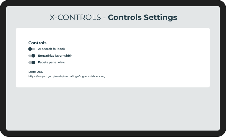
Set up the following options:
- AI search fallback: You can turn it on to activate AI Carousels as a fallback when keyword search returns no results. This toggle is activated by default.
- Empathize layer width: You can turn it on to span the predictive layer to the full width of the page. If turned off, the predictive layer matches the width of the search box. This toggle is deactivated by default.
- Facets panel view: You can turn it on to display facets as an overlay on the right of the search layer. If turned off, facets display as a column next to the results grid. This toggle is activated by default.
- Logo URL: Address of the store logo to display.
Configuring grid view settings
This section lets you configure how shoppers view and browse the results in the grid.
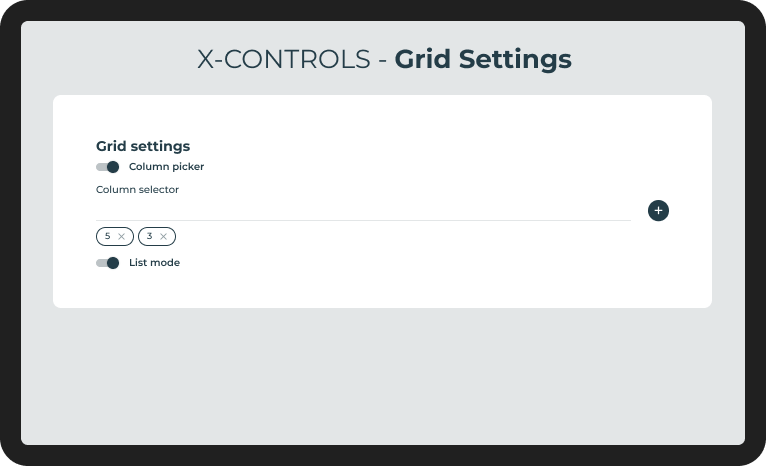
Set up the following options:
Column picker: You can turn it on to display the Column picker button and let shoppers choose the number of columns to display in the results grid. This toggle is activated by default.
Column selector: Number of columns available in the Column picker button in desktop devices. For example, if you set '2' and '4', shoppers can choose display results in a two-column or four-column grid. The Column selector doesn't support a one-column option, if the List mode toggle is activated. The default values are
4and2for desktop devices. Values for mobile devices are predefined to2and1, and can't be changed.Column selector order
The order of number of columns set in the Column selector field determines the order in which the available options in the Column Picker button is displayed.
List mode: You can turn it on to display the List button and let shoppers switch to a list view on the results page. The list view uses a one-column grid with a different card design. The List button only displays when the Column picker toggle is also activated. This toggle is deactivated by default.
Configuring search layer style settings
This section lets you configure the following fields to set up the color palette, fonts, and component styles for the search layer so it can match your branding style.
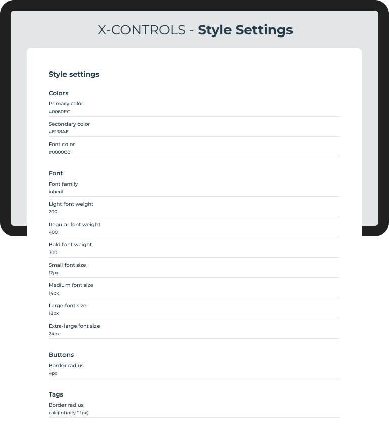
Set up the following options for colors, fonts, and borders:
Colors: In this section, configure the color palette for your search layer:
- Primary color: Determines the hex color code for primary elements in the search layer, such as buttons and selectors.
- Secondary color: Determines the hex color code for secondary elements.
- Font color: Determines the hex color code for text elements.
Font: In this section, configure the fonts used in your search layer:
- Font family: Determines the CSS value of the font family for all text in the layer. The font family of the commerce store website is inherited by default.
- Light font weight: Determines the CSS value of the font weight for light text. The default value is
200. - Regular font weight: Determines the CSS value of the font weight for regular text. The default value is
400. - Bold font weight: Determines the CSS value of the font weight for bold text. The default value is
700. - Small font size: Determines the CSS value of the font size for small text. The default value is
12px. - Medium font size: Determines the CSS value of the font size for medium text. The default value is
14px. - Large font size: Determines the CSS value of the font size for large text. The default value is
18px. - Extra-large font size: Determines the CSS value of the font size for extra-large text. The default value is
24px.
Button styles: In this section, configure the style for buttons in your search layer:
- Border radius: Determines the CSS value of the border radius for buttons. The default value is
4px.
Tag styles: In this section, configure the style for tags in your search layer:
- Border radius: Determines the CSS value of the border radius for tags. The default value is
0px.
Configuring query preview carousels
Query preview carousels display suggested queries to shoppers before they start typing in the search box.
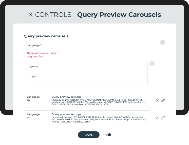
For each store language, configure the following fields to set up this type of carousels:
- Language: Store language where the query preview carousel displays. This field is mandatory. It supports non-regionalized, two-letter characters, such as "en" for English or "es" for Spanish.
- Query preview settings: Determines the query previews to display for the language set, including:
- Query: Search query whose product results display in the carousel. This field is mandatory.
- Title: Title of the carousel that displays above it. This field is mandatory.
Activating X-Controls
Once you have updated the configuration and clicked Save, you need to activate the X-Controls settings by turning on the toggle switch.